A premium mattress brand needed a website redesign that better communicated comfort, quality, and trust while improving the overall buying experience.
Mattress Brand already had a website, but the existing experience did not reflect the quality of the brand or support users well through the decision-making process. The redesign needed to improve clarity, trust, and product presentation without losing the brand's core identity.
I reworked the interface with a cleaner, image-led layout that put the product front and centre. The information architecture was refined around the customer journey, from discovery to comparison to purchase, while preserving the brand feel and making the experience more intuitive.
The redesign gave Mattress Brand a more polished and conversion-focused digital presence, with clearer structure, stronger visual communication, and a user experience that better matched the quality of the product.
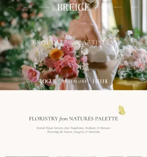
A UK-based floral brand needed a clean website developed with an animated intro and a structure that would stay easy to manage with minimal plugin dependence.
The client wanted a refined website that felt elegant and premium without becoming difficult to maintain over time. The experience needed an animated intro, a clean overall presentation, and a lightweight setup that avoided unnecessary plugin complexity while still supporting smooth content management.
I developed the website in WordPress with a strong focus on visual cleanliness, careful motion, and simpler long-term maintainability. GSAP was used to support the animated intro and enhance the feel of the experience, while the build was kept intentionally lean so the client could manage the site more easily with minimal plugin reliance.
The final website gives the UK-based brand a more polished digital presence with a clean structure, elegant motion, and a setup that is easier to manage day to day without excessive plugin overhead.
A hospitality brand needed a bold landing page that could present membership tiers clearly, build exclusivity, and drive pre-opening enquiries.
The brand needed a high-impact page that felt premium from the first screen while still making the membership structure easy to understand. The pricing, benefits, and call to action had to feel exclusive without becoming visually cluttered.
I shaped the page around a dark hospitality-led visual system, strong type, and clearly separated membership cards. The layout keeps the hero cinematic while making the tier comparison and CTA section quick to scan on both desktop and mobile.
The result is a sharper pre-launch experience that communicates prestige, simplifies the offer structure, and gives the brand a stronger digital sales page for early member acquisition.
A B2B beverage platform needed a website experience that could spotlight smoothies, refreshers, protein powders, and product categories while reinforcing freshness and business-ready credibility.
The store needed to communicate a bright, product-focused personality while still feeling commercially polished for a B2B audience. Product families such as refreshers, purees, and powders had to be easy to browse without losing the playful brand energy.
I built the page around clean category segmentation, pastel product storytelling, and a hero section that immediately frames freshness and product value. Supporting trust badges and quick product pathways help the store feel both friendly and business-ready.
The final direction gives the brand a more distinctive storefront with better category clarity, stronger visual merchandising, and a homepage better suited for B2B growth.
An agriculture business needed a cleaner website to present produce, machinery, and company information in a way that felt modern, trustworthy, and rooted in its sector.
The website had to balance multiple business areas without feeling fragmented. Product information, brand positioning, and agricultural credibility all needed to come through quickly for both trade buyers and general visitors.
I used large photographic sections, simple icon-led content blocks, and a calm green-accented interface to organize the different offerings. The layout was planned to feel informative and natural rather than overly corporate.
The redesigned site presents the business with greater clarity and professionalism, making it easier to understand and giving its product and company pages a more confident digital presence.
A supplement business needed its existing website redesigned and migrated to create a storefront that made health products easier to discover while reinforcing credibility and care.
The client already had an existing website, but it needed both a redesign and a migration to improve the overall experience. The new storefront had to communicate medical confidence without feeling sterile, while product discovery, reassurance, and category navigation all needed to work together for users seeking trusted health solutions online.
I approached the project by redesigning the storefront with a cleaner visual system and migrating the website into a more polished structure. Soft color, supportive messaging, and catalog-first layout decisions kept the page approachable, while product cards, informational pathways, and service highlights helped the storefront feel both professional and easy to use.
The redesigned and migrated storefront creates a stronger balance between credibility and accessibility, helping visitors browse products more comfortably and giving the brand a more polished e-commerce presence.
An electricity rate comparison platform needed a Magento store website design that could present multiple plans clearly and make the browsing experience easier for customers.
The platform needed to present multiple electricity plans without overwhelming visitors while keeping the shopping experience clear and structured. Plan comparison, pricing visibility, and sign-up intent all had to work together within a store-style interface.
I designed the website around a clearer Magento store experience with structured plan listing, stronger pricing hierarchy, and cleaner paths into signup and product selection. The interface was shaped to make multiple offers easier to compare while still feeling commercially polished.
The result is a more usable Magento store design that surfaces the key rate information faster, improves plan comparison, and gives users a clearer path toward selecting the right electricity option.
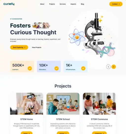
Curiefy needed a modern website that could explain its STEM learning mission, showcase projects, and feel engaging for parents, schools, and young learners.
The brand had to appeal to multiple audiences at once, including children, parents, and institutions. The interface needed to feel imaginative and educational while still presenting the organization as credible and well structured.
I designed the experience around playful science-led imagery, spacious content sections, and clear project grouping. The page balances wonder and structure so the brand feels energetic without sacrificing readability.
The finished UI gives Curiefy a stronger digital identity, better communicates its STEM focus, and makes its programs and initiatives more inviting to explore.
A property-focused service brand needed a campaign landing page that could explain its savings model quickly, feature a cost calculator, and generate valuation enquiries.
The landing page needed to support a campaign-focused conversion flow built around trust, clarity, and low-friction lead capture. It had to explain commission savings clearly, include a cost calculator, and still feel reassuring enough for homeowners to submit their details.
I structured the landing page around a clear hero message, a simple enquiry form, a cost calculator, and a savings comparison block that visualizes the financial difference. The page was designed for WordPress and Elementor, with supporting sections kept clean and confidence-building to reduce hesitation.
The final landing page makes the offer easier to understand at a glance, gives users a more interactive way to estimate savings through the calculator, and creates a stronger foundation for generating homeowner leads online.
A new automotive service brand needed a clean website and logo design that could communicate professionalism, safety, and service reliability at first glance.
As a newly launched brand, the business needed both a clean website and a logo design that felt more established from day one. The site also needed to clearly support service booking and storage enquiries while making the overall experience feel trustworthy and easy to use.
I built the experience around a clean service-focused layout, strong visual hierarchy, and branded presentation that helped the new business feel more credible. The structure highlights storage and service options clearly, and I used the Bookly plugin to support the booking flow in a way that felt straightforward for visitors.
The final result gives the new brand a more polished launch presence, with a cleaner identity, clearer service presentation, and a more practical booking journey for customers looking to reserve storage or related services.
A sustainable bag brand needed a website redesign that could combine product appeal with eco-friendly messaging while clearly highlighting that the bags are 100% recyclable and can hold 200+ lbs.
The redesigned homepage needed to sell a lifestyle product while also reinforcing the brand's environmental angle and core product strengths. Messages like 100% recyclable and holds 200+ lbs had to stand out clearly, while product color variety, sustainability cues, and shoppability still needed to coexist without making the page feel busy.
I built the redesign around airy spacing, lifestyle photography, and focused product presentation. Key value messages such as 100% recyclable and holds 200+ lbs were given stronger visibility as proof points, while the layout stayed centered on product discovery and visual appeal.
The redesigned page gives the brand a cleaner and more marketable online presence, helping its products feel desirable while making the eco-conscious positioning and product strength more visible and believable.
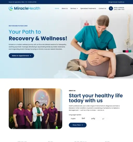
SA Miracle Health, a Canada-based clinic, was launching a new practice and needed a clean, professional website, refreshed branding, and supporting clinic materials to present the business clearly from day one.
As a new Canada-based clinic, the business needed a strong first impression both online and offline. The existing logo did not look polished enough, so the client needed a redesign along with a clean, trustworthy website that could clearly present doctor profiles, services, products, pricing, written testimonials, and video testimonials. They also needed dependable website support plus branded materials such as social media pages, social posts, business cards, letterheads, and other clinic forms without the overall identity feeling inconsistent.
I approached the project as a broader clinic launch system rather than just a website. I refined the brand direction with a cleaner logo treatment, designed the website UI in Figma, and structured the site around clear sections for doctor profiles, services, products, pricing, and testimonial content including video testimonials. Alongside the website, I supported the clinic with social media pages, post creatives, business cards, letterheads, and other branded forms used in the clinic, while also planning for ongoing website support after launch.
The final outcome gave the Canada-based clinic a more professional launch presence across digital and print touchpoints. With the refreshed logo, cleaner website, branded clinic materials, social assets, and ongoing website support, the business was better equipped to present its services with clarity and build trust with prospective patients from the start.
A birds and pet accessories marketplace needed an e-commerce homepage that could feel lively, category-rich, and easy to shop.
The storefront had to handle multiple product categories, live birds, accessories, and featured products without losing clarity. It also needed a personality-led visual direction that felt bright and memorable.
I built the homepage around bold hero imagery, color-coded category blocks, and simple promotional sections. The structure gives each shopping path a clear place while keeping the brand's energetic tone intact.
The final UI creates a more distinctive and organized shopping experience, helping the marketplace showcase its variety without feeling chaotic.
A cookie brand needed a storefront homepage that could feel giftable, playful, and conversion-ready while keeping product discovery effortless.
The website had to balance indulgent brand personality with practical shopping behavior. Gifting pathways, category choices, and brand credibility all needed to come through quickly on the homepage.
I leaned into a rich visual style with strong contrast, circular hero framing, and quick gifting prompts. Supporting badges and browsing controls were placed to encourage both impulse shopping and more intentional purchase journeys.
The concept gives the brand a more memorable digital storefront and improves the clarity of its shopping paths for both everyday orders and gift-driven purchases.
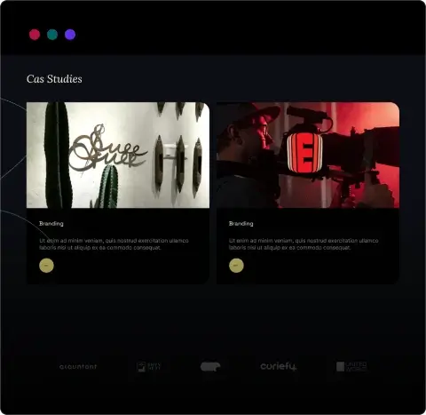
An e-commerce growth agency needed a bold website that could communicate experience, services, and results with more confidence.
The homepage needed to feel high-energy and modern while still supporting service clarity and trust. The brand promise, case-study intent, and lead-generation elements had to work together without making the page hard to read.
I built the page around a striking lime-led visual direction, large typography, and modular service storytelling. The layout keeps the agency's authority visible while making calls to action and proof points easy to find.
The redesigned homepage gives the agency a more distinctive digital identity and presents its e-commerce expertise in a way that feels more current and commercially credible.
A mobility and aging-in-place brand needed a website that could explain assistive products more clearly while maintaining a calm, trustworthy tone.
The site had to present specialized products in a way that felt easy to understand for families, caregivers, and older users. Product education and reassurance were just as important as catalog visibility.
I used a soft healthcare-adjacent interface, focused product callouts, and supportive imagery to simplify the browsing experience. Content blocks were arranged to explain the brand mission before moving into product highlights.
The website direction gives the brand a clearer and more empathetic digital presence, helping visitors understand the product value faster and explore the catalog with more confidence.
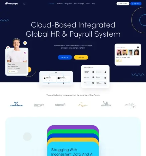
A global HR and payroll platform needed an animated website that could present a complex SaaS offer in a way that felt clear, modern, and enterprise-ready.
The business offered multiple capabilities across HR, payroll, and employee data, so the website needed to simplify the story without making the product feel limited. The client also wanted an animated website experience that felt polished and modern while still projecting scale and credibility for larger organizations.
I created a product-led interface with feature framing, UI previews, trust-building client references, and motion-led sections designed to support an animated website experience. The layout helps the platform feel capable and organized while keeping the core value proposition easy to grasp.
The final direction presents the SaaS offering more confidently, combining a clearer product story with an animated website feel that makes the brand appear more current and better aligned with the expectations of enterprise buyers.
A home healthcare provider needed a welcoming website that could present services clearly, build trust, and support patient and family enquiries.
The website needed to feel compassionate and professional at the same time. Visitors had to be able to understand service categories, care options, and next steps quickly, often while making sensitive family decisions.
I used a bright, service-led layout with approachable imagery, clearly grouped care categories, and strong action points. The interface was designed to feel supportive without becoming overly clinical.
The finished direction gives the provider a more trustworthy and user-friendly web presence, helping visitors find relevant care information faster and encouraging more confident enquiries.
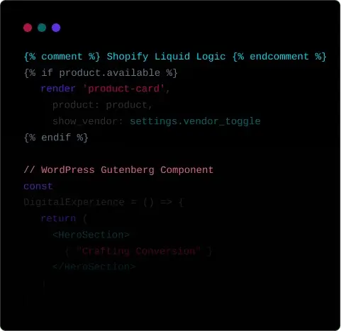
An eCommerce Agency needed a website direction that could reflect its positioning around guidance, direction, and strategic digital growth while presenting its e-commerce expertise with more clarity and confidence.
The challenge was to translate a brand built around strategizing, optimizing, and solving complex e-commerce and technology problems into a digital experience that felt clear, modern, and dependable. The website had to communicate technical capability, business direction, and trust without becoming visually heavy or difficult for merchants and decision-makers to follow.
I shaped the interface around the same thinking reflected in the brand direction, where the compass-inspired "V" symbol suggests guidance, direction, precision, and forward movement. The layout uses clean modern typography, bright blue accents, and structured content flow to reinforce innovation, technical expertise, and solution-led clarity. Service sections, proof points, and platform messaging were arranged to make the business feel like a reliable guide helping clients move confidently toward the right digital commerce outcomes.
The final direction gives eCommerce Agency a more confident and strategically aligned digital presence, making its services feel clearer, more professional, and more growth-oriented. It positions the brand as a trustworthy partner for businesses looking to navigate e-commerce and technology challenges with sharper direction and stronger execution.
A premium home decor brand needed a clean Shopify website along with refined launch branding to present its products and identity more professionally.
The client needed a more premium brand presentation across both print and digital touchpoints. Along with a clean Shopify website, the project also needed a stronger logo direction, branding consistency, business cards, and letterheads that would make the brand feel more polished and trustworthy.
I approached the project as a combined branding and e-commerce design system, refining the visual identity with a premium logo treatment and coordinated stationery while shaping the Shopify storefront around clean product presentation and a more elegant browsing experience.
The final result gave the brand a stronger premium identity across its logo, business materials, and website, creating a cleaner Shopify presence that presents the product range more professionally and supports a more cohesive launch image.
A food delivery startup needed a mobile app interface that could compete with market leaders while feeling fast, fresh, and easy to use.
The existing concept lacked a coherent visual language and had too many friction points in the ordering flow. Users were dropping off before completing checkout, and the interface felt cluttered on smaller screens.
I simplified the navigation structure, introduced a card-based browsing system, and built a streamlined 3-step checkout flow. Appetite-driven imagery, bold category labels, and real-time status indicators were layered in to keep the experience engaging.
The redesigned UI brought clarity and confidence to the ordering experience, reducing decision friction and creating a strong visual identity the brand could build on.
CMRL India needed a new website design and WordPress development to replace an outdated static site, improve UI/UX, and present product and investor information more clearly.
CMRL India's older website was static, difficult to update, and weak from a UI/UX perspective. The business needed a more modern website experience that could clearly present chemical manufacturing products, company information, and investor-relations content while making regular website updates easier for the internal team.
I redesigned the website around the company's requirements with a cleaner information architecture, improved visual hierarchy, and clearer user journeys for both product pages and investor information. The new experience included structured product presentation, transparent company and financial information, BSE stock-price display, and easier access to investor downloads. After finalising the UI/UX design, the new website was developed on WordPress so the team could easily manage content, update company information, and publish stock-related and corporate documents. Security measures were also implemented as part of the build to support safer day-to-day website management.
The new WordPress website gave CMRL India a more professional digital presence, with easier content management, clearer product communication, stronger corporate transparency, improved security, and better support for investors through accessible stock-related and company downloads.
An accounting and taxation firm needed a website that built trust quickly, explained their services clearly, and converted visitors into enquiries.
Financial services websites often feel either overly corporate or confusingly technical. Akauntant needed to strike a balance, approachable enough for individuals and small businesses, credible enough for corporate clients.
I led with a calm, structured layout that used plain-language service descriptions, clear pricing tiers, and trust indicators like accreditations and client testimonials. A prominent contact form and click-to-call placement reduced the steps to conversion.
Akauntant launched with a site that clearly differentiated them from generic accounting firms, generating consistent inbound enquiries from both individual and business clients.
A UAE engineering consultancy needed a new bilingual website in English and Arabic to launch its brand online, present its services clearly, and build trust with clients in construction, planning, and design.
The client was launching a new engineering consultancy brand in the UAE and did not have an existing website. They needed a professional online presence that could introduce the brand, explain services, and support both English- and Arabic-speaking audiences while aligning with the expectations of the UAE construction and engineering market.
I designed and developed a single-page website based on the client's requirements, with a clean corporate layout, clear service sections, project highlights, team presentation, and contact touchpoints. The site was built in WordPress with a custom theme and JavaScript enhancements, making it easier to manage content while supporting both English and Arabic for a bilingual UAE audience.
The completed website gave the new brand a credible digital presence in the UAE, helping present engineering consultancy services more professionally to potential clients, partners, and project stakeholders. It also provided a flexible WordPress foundation for future content updates as the business grows.
Einstin Media needed a custom website and WordPress CMS to publish company details, showcase production work, and present teasers and trailers in a more professional and cinematic way.
Einstin Media did not have a website to publish its film production details, showcase completed work, or share teaser and trailer content. The client needed a custom-designed digital presence that could reflect the quality of the company and support the way they present creative stories and production work.
I designed a custom website with a cinematic visual direction and built it on WordPress with a custom CMS setup. The structure was planned to highlight company information, film production services, featured work, and media content such as teasers and trailers, while keeping content management simple for the client.
The finished website gave the company a strong online platform to present its brand, publish media content, and promote its work more professionally. It also created a flexible WordPress foundation for ongoing updates as the studio grows and releases new projects.
A UAE facility management company launching a new brand needed complete branding, marketing assets, website design, and WordPress development to present its services professionally and support business growth.
Elite Facility Management was starting as a new brand in the UAE and needed a complete visual identity and digital presence in a limited timeline. The client required everything from logo and brand assets to a professional website that could present their services clearly and help establish trust in the competitive UAE facility management market.
I handled the branding and digital rollout end to end, including logo design, business card, letterhead, envelope, van sticker design, email signature, company profile brochure, website design, and WordPress website development. The visual direction was built to feel clean, reliable, and corporate, while the website structure focused on clearly presenting facility management services and making the brand look established from launch.
The project was completed within the client's tight deadline, giving Elite Facility Management a complete launch-ready brand system and a professional website for the UAE market. The client was very happy with the final result, and the combined branding and WordPress website created a strong foundation for marketing, sales presentation, and business development.
A US-based software development and SaaS client needed an existing React website migrated to WordPress so the team could manage and update content more easily without changing the established design.
Charles and the Foresight team already had a website built in React, but updating content was not convenient for their ongoing needs. They wanted the website migrated to WordPress so content editing would be simpler for the team, while keeping the same visual design and overall user experience intact.
I rebuilt the website in WordPress using Elementor and a custom WordPress theme, carefully matching the existing design so the migration felt seamless. The focus was on preserving the original layout and brand presentation while giving the client a much more flexible CMS for future content updates and internal management.
The completed migration gave the client the best of both worlds, the same familiar website design with a much easier WordPress-based editing workflow. This made the site more practical for day-to-day content management while keeping the product and company presentation consistent for their US audience.
A clothing brand needed a redesign of its existing website UI to create a cleaner shopping experience and a stronger visual presentation for online customers.
The existing website needed a visual refresh to improve the overall user experience and make the digital storefront feel more polished, modern, and aligned with the brand's product presentation.
I redesigned the interface with a more refined layout, clearer product browsing, improved visual hierarchy, and a cleaner overall shopping flow. The goal was to make the experience feel more premium while staying easy to use across the website.
The refreshed UI gave the website a more modern and professional look, helping the brand present its products more effectively and creating a better overall experience for visitors.
A precision engineering business needed its first website to build an online presence and present specialized manufacturing capabilities more professionally to industrial clients.
The founder had strong experience and technical expertise in precision engineering, but the business did not yet have an online presence. They needed a professional website to introduce the company, present products and capabilities clearly, and give potential clients a trusted digital reference point.
I designed and developed the website in WordPress with a clean, technical presentation suited to the engineering sector. The structure was planned to highlight product categories, manufacturing strengths, company details, and contact information in a way that feels professional, clear, and easy to manage.
The finished website gave Kentech a professional online presence that matched the founder's expertise and made the business easier to present to new customers. It created a solid digital foundation for enquiries, product visibility, and future business growth.
Power India Electricals needed a redesign and WordPress development upgrade for its existing static website to improve UI/UX, present services more professionally, and strengthen its digital presence in the electrical manufacturing and contracting space.
Power India Electricals already had a static website, but it did not offer a strong user experience or a modern presentation of the brand, services, and capabilities. The business needed a redesigned website that would better represent its electrical manufacturing and contracting expertise while making the overall experience more polished and professional.
I redesigned the website and developed it in WordPress, creating a more modern structure for company information, services, solutions, and contact touchpoints. Along with the website work, I also supported the brand with brochure and poster design so the company's marketing materials would feel more aligned and professional across both print and digital use.
The completed project gave Power India Electricals a stronger digital presence, a better user experience, and a more credible brand presentation for clients, contractors, engineers, and industrial stakeholders. The redesigned WordPress website, together with the supporting print materials, created a more consistent and professional business image.
Suee, a Kerala-based handloom fashion and lifestyle brand, needed a custom Shopify store to present its products more professionally and support a smoother B2C and D2C e-commerce experience for a growing digital audience.
Suee is a socially driven handloom fashion brand from Kerala, associated with artisans and cooperative networks, and the online store needed to reflect that identity clearly. The challenge was to turn the approved design into a polished Shopify experience that could support product storytelling, digital sales, and a more professional presentation of the brand's handcrafted clothing and lifestyle products across B2C and D2C channels, while still supporting the brand's wider business presence.
I developed the approved design into a custom Shopify storefront with careful attention to layout accuracy, product presentation, and usability. The structure was built to support Suee's handcrafted brand identity, product storytelling, and direct-to-customer shopping flow, while also allowing space for additional features, content refinement, and dependable post-launch support. The storefront needed to feel consistent with a brand known for social impact, artisan collaboration, and a growing reputation in Kerala's handloom and fashion space.
The finished store gave Suee a more professional e-commerce presence that matched the requested design and supported the brand's digital growth more effectively. It created a stronger online foundation for presenting handcrafted handloom products, connecting with customers beyond physical locations and exhibitions, and supporting a brand already recognized for social entrepreneurship, women-led business, and achievements such as the Jwala Award.
The logo concept is designed around the integration of conversational AI and product inventory intelligence for a smarter B2B commerce experience.
The identity needed to communicate product management, communication, and automation together in a way that felt clear and modern. It also had to connect naturally with B2B catalog workflows without becoming visually complicated or too generic for software branding.
I built the symbol by combining a chat bubble icon with a barcode element to represent real-time communication, SKU-based inventory intelligence, and automated sales interaction. The mark reflects a system where customers can talk naturally with product catalogs, request quotes, check stock, and receive instant AI-driven responses. Clean modern typography keeps the identity readable and scalable, while the mint-green accent introduces a sense of simplicity, innovation, accessibility, and digital efficiency.
The final identity positions the platform as a smart digital assistant that transforms traditional catalogs into an interactive and intelligent sales experience. It gives the business a clearer visual signature for manufacturers, distributors, and wholesalers looking for more efficient digital commerce workflows.
This logo was created to celebrate the tenth anniversary of .Online, combining the existing brand identity with a subtle visual expression of the ten-year milestone.
The concept needed to celebrate ten years of .Online without disconnecting from the brand users already recognized. The anniversary idea had to feel creative and symbolic while still keeping the logo clear, modern, and strongly tied to the GoDaddy brand ecosystem.
I focused on the "in" from the word Online and used a reflective treatment below the letters so the form subtly reads as the number 10. The palette was inspired by recognizable GoDaddy brand colors to maintain a strong visual connection, while the glowing reflection added a more digital, connected feel that supports the online and technology-led context. The green dot element was kept as a memorable brand cue to reinforce the .Online identity.
The final concept delivered a more celebratory and brand-connected anniversary mark that honored the ten-year milestone without losing clarity. It was awarded 1st Place in the GoDaddy .Online 10 Years Logo Design Contest, giving the concept both strong creative recognition and clear campaign value.
The logo concept is designed around the fusion of artificial intelligence and human intelligence within a unified innovation ecosystem.
The identity needed to communicate advanced technology and human insight together, without leaning too far into either cold automation or abstract creativity. It also had to work as a strong standalone symbol for product, app, and digital platform use.
I built the mark around a hexagonal outer shape to represent a "hub" — a structured space for connection, collaboration, and integrated solutions. Inside that form, the left blue section represents AI through circuit-inspired patterns symbolizing technology, data, automation, and digital intelligence, while the right purple section represents the human brain through a more organic pattern language tied to creativity, strategy, and human insight. The modern gradient palette reinforces innovation, transformation, and future-focused digital capability.
The final identity creates a clearer and more meaningful visual system that communicates synergy between human expertise and advanced AI technology. It establishes a stronger brand foundation for digital product, web, and presentation use while positioning the platform as modern, intelligent, and collaborative.
The logo concept is designed to express premium heritage gifting through an elegant mandala-inspired emblem paired with a refined luxury wordmark.
The identity needed to communicate craftsmanship, tradition, and luxury while still feeling clear and usable across packaging, gifting, and digital brand materials. It had to carry cultural richness without becoming visually heavy or losing elegance.
I built the concept around a symmetrical mandala-inspired emblem to symbolize craftsmanship, refinement, timeless beauty, and the cultural richness associated with curated brassware, decor, and luxury gifting. The ornamental structure gives the brand a handcrafted premium feel, while the soft earthy palette creates a warm and sophisticated emotional tone that suggests exclusivity, grace, and authenticity. A classic serif wordmark reinforces luxury, trust, and enduring value.
The final identity positions the brand as a more refined destination for meaningful and culturally inspired premium gifting. It gives the business a stronger visual signature for luxury product presentation, packaging, and elegant marketing use.
The logo concept is designed to represent a modern and trustworthy vehicle-buying platform through a clean wordmark with automotive-inspired wheel elements integrated into the typography.
The identity needed to feel friendly and approachable without losing trust or commercial clarity. It had to connect clearly to vehicle purchasing while presenting the brand as a smooth, customer-focused digital platform.
I built the concept around a clean wordmark enhanced with wheel-inspired details integrated directly into the lettering to symbolize mobility, vehicle selection, and seamless transportation solutions. The rounded custom letterforms create a smooth and approachable visual flow, helping the identity reflect an easy and customer-friendly buying experience. A balanced mix of deep blue and warm accent tones was used to communicate reliability, confidence, energy, and innovation.
The final identity positions the platform as a more contemporary digital marketplace with a brand signature that feels memorable, accessible, and trustworthy. It gives the business a clearer visual foundation for communicating convenient, efficient, and modern vehicle purchasing.
The logo concept combines a professional serif wordmark with a financial symbol integration that makes the brand immediately relevant to tax, percentages, and calculation.
The identity needed to feel credible and finance-ready without looking cold or overly traditional. It had to communicate taxation, clarity, and calculation while still giving the brand a more modern and approachable presence.
I built the concept around a serif wordmark and replaced the "x" with a stylized percent sign using a diagonal slash and two dots. That move immediately reinforces themes of taxation, finance, percentages, and calculation while keeping the wordmark clean and memorable. The dark navy typography was chosen to communicate trust, authority, and reliability, while the teal accents introduce a more contemporary fintech feel associated with innovation, simplicity, and clarity.
The final identity gives the brand a stronger signature that feels both professional and current, positioning it well for a tax, accounting, or financial technology platform focused on making complex financial processes feel smarter, clearer, and more approachable.
The logo concept is centered around durability, storage, and automotive reliability, combining a bold industrial-style wordmark with a circular tire-inspired emblem.
The identity needed to communicate tire handling, secure storage, and long-term vehicle care in a way that felt strong, organized, and dependable. It had to look modern and service-led while still carrying the trust and safety cues expected in the automotive industry.
I built the concept around a bold, industrial-style wordmark paired with a circular emblem inspired by stacked tires and rotational motion. The clean geometric typography helps communicate structure, strength, and professionalism, while the deep blue palette reinforces trust, safety, and operational dependability across automotive service touchpoints.
The final identity creates a more modern and reliable brand presence that communicates efficiency, organization, and secure storage. It gives the business a stronger visual foundation for representing tire services and long-term automotive care.
The logo concept is built around connectivity, precision, and industrial collaboration, using a geometric monogram to express movement and technical integration.
The identity needed to feel professional and engineering-led while also communicating collaboration, movement, and dependable trade relationships. It had to stay clean and modern enough for business use across signage, documents, and digital touchpoints without losing its industrial character.
I built the logo around a clean geometric monogram formed by three directional arrow elements. The arrows symbolize progress, supply flow, and interconnected trade relationships between manufacturers, distributors, and clients, while also suggesting forward momentum, efficiency, and problem-solving. The minimalist angular construction and strong dark-blue palette were used to reinforce professionalism, trust, engineering accuracy, and modern business reliability.
The final identity gives the brand a clearer and more strategic signature that feels precise, industrial, and dependable. It creates a stronger visual foundation for a business positioned around hardware, architectural solutions, and long-term trade collaboration.
The logo concept is designed around guidance, direction, and strategic digital growth for an e-commerce development agency.
The identity needed to communicate expertise, navigation, and dependable digital problem-solving in a way that felt modern and professional. It had to suggest strategic support for e-commerce and technology challenges without becoming visually heavy or overly technical.
I built the concept around a compass-inspired arrow symbol shaped into the letter "V" to represent the brand initial while visually expressing guidance toward the right business solutions and outcomes. The forward-pointing form communicates progress, precision, decision-making, and momentum, aligning with a service model focused on strategizing, optimizing, and solving complex e-commerce and technology challenges. Clean modern typography and a vibrant blue gradient reinforce innovation, trust, and technical expertise.
The final identity creates a professional and future-facing brand presence that positions the agency as a reliable guide for businesses navigating digital commerce. It gives the brand a clearer visual system for expressing confidence, technical capability, and strategic direction.