The Challenge
The existing concept lacked a coherent visual language and had too many friction points in the ordering flow. Users were dropping off before completing checkout, and the interface felt cluttered on smaller screens.
Our Approach
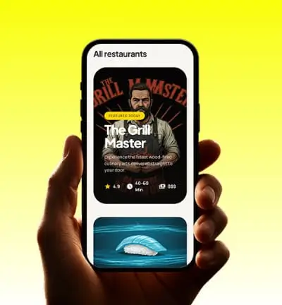
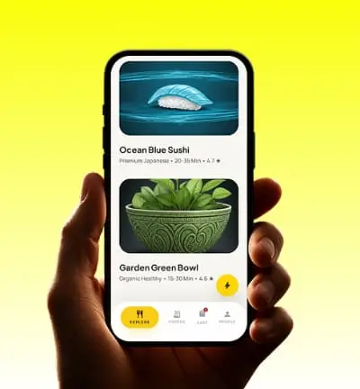
I simplified the navigation structure, introduced a card-based browsing system, and built a streamlined 3-step checkout flow. Appetite-driven imagery, bold category labels, and real-time status indicators were layered in to keep the experience engaging.
Outcome
The redesigned UI brought clarity and confidence to the ordering experience, reducing decision friction and creating a strong visual identity the brand could build on.