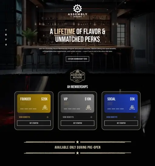
The Challenge
The brand needed a high-impact page that felt premium from the first screen while still making the membership structure easy to understand. The pricing, benefits, and call to action had to feel exclusive without becoming visually cluttered.
Our Approach
I shaped the page around a dark hospitality-led visual system, strong type, and clearly separated membership cards. The layout keeps the hero cinematic while making the tier comparison and CTA section quick to scan on both desktop and mobile.
Outcome
The result is a sharper pre-launch experience that communicates prestige, simplifies the offer structure, and gives the brand a stronger digital sales page for early member acquisition.