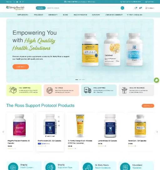
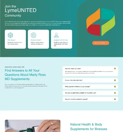
The Challenge
The client already had an existing website, but it needed both a redesign and a migration to improve the overall experience. The new storefront had to communicate medical confidence without feeling sterile, while product discovery, reassurance, and category navigation all needed to work together for users seeking trusted health solutions online.
Our Approach
I approached the project by redesigning the storefront with a cleaner visual system and migrating the website into a more polished structure. Soft color, supportive messaging, and catalog-first layout decisions kept the page approachable, while product cards, informational pathways, and service highlights helped the storefront feel both professional and easy to use.
Outcome
The redesigned and migrated storefront creates a stronger balance between credibility and accessibility, helping visitors browse products more comfortably and giving the brand a more polished e-commerce presence.