The Challenge
The challenge was to translate a brand built around strategizing, optimizing, and solving complex e-commerce and technology problems into a digital experience that felt clear, modern, and dependable. The website had to communicate technical capability, business direction, and trust without becoming visually heavy or difficult for merchants and decision-makers to follow.
Our Approach
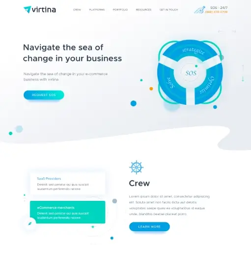
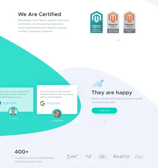
I shaped the interface around the same thinking reflected in the brand direction, where the compass-inspired "V" symbol suggests guidance, direction, precision, and forward movement. The layout uses clean modern typography, bright blue accents, and structured content flow to reinforce innovation, technical expertise, and solution-led clarity. Service sections, proof points, and platform messaging were arranged to make the business feel like a reliable guide helping clients move confidently toward the right digital commerce outcomes.
Outcome
The final direction gives Virtina a more confident and strategically aligned digital presence, making its services feel clearer, more professional, and more growth-oriented. It positions the brand as a trustworthy partner for businesses looking to navigate e-commerce and technology challenges with sharper direction and stronger execution.